One of SeeMe Digital's highest priorities for creating custom websites is loading speed.
It doesn't matter how good your site looks and how many tricks it can do if it doesn't load quickly enough to keep people from clicking away to something else.
Also, speed counts in SEO.
The Website Loading Speed page has more information.
The site looks like it fits on mobile screens as well as large resolutions. Mobile visitors can use the site without pinching and pushing, zooming in and out, and having to scroll back and forth just to read each line of text.
Mobile users are becoming more and more common. These screens are smaller and include special concerns for ease of mobile access.
Extensive device testing with up-to-date resolution and browser usage statistics. More information: Website Display Widths
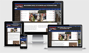
Woodring Wall of Honor Responsive Website created with PHP, CSS3, JavaScript, and custom graphics
Animated custom JavaScript billboard scrolls through menu items with corresponding images displayed in the center. Billboard is interactive: hovering over a menu item increases opacity of the name and custom flag graphic while bringing that section's photograph up in the center. Moving the mouse away from the billboard will allow the automatic slide show to resume. Clicking or tapping a menu item will take the viewer to that page on the site.
The Mission section is CSS3 interactive: hover or tap to display the mission, and move/tap away to put it away.
The site menu is a CSS3 hover dropdown. The submenus display statically in each section for mobile/touch.
Photographs courtesy Woodring Wall of Honor and Veterans Park, Inc.
Elastic means the buttons, bars, boxes, and other containers expand to accommodate larger font sizes for people who have their browsers or whole devices set for a larger text size.
Not only do elastic sites allow the text size to change, but it changes without breaking the site and making navigation impossible or content unreadable.
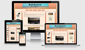
Sundance Wine & Spirits: Commercial Responsive and Elastic Website utilizing CSS3, SQL database integration, and PHP scripting
Full Custom Administrative Database Content Management System in PHP and SQL
CSS3 interactive center panel images zoom out on hover or tap, and resume original size when viewer moves/taps away.
This business also had webmaster services and regular updates.
Southwest silhouette vector graphics from Stanislav, Nat Maclean widget
Custom websites can include lots of things the templates don't, including more of your own individual style and your own database integration.
They can be much better optimized for speed and responsiveness, as well as elasticity and accessibility.
They can also include multiple image assets for responsive efficiency and quality. With websites now spanning from 240 to 5120 pixels wide, mobile users can receive smaller image files while large, high resolution screens can receive larger file sizes.
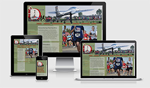
Red Dirt Run of Honor: Custom Responsive Event Website created with PHP, CSS3, a JavaScript image slide show, and a JQuery animated sponsor bar
Interactive sponsor bar pauses on hover and allows viewers to click sponsor logos if they want to visit sponsor websites. Animation resumes on mouse out.
For wide accessibility, the entire site has a text version.
Photographs courtesy of the Woodring Wall of Honor and Veteran's Park, Inc.
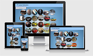
Sx Custom Fabrication: Custom Responsive Commercial Website front page created with CSS3 animations and transformations
CSS3 interactive "bubbles" dance around the page, but each will pause on hover/tap, expanding into a square. Moving/tapping away resumes the dance as well as the round shape of the image.
This page is the front-runner to an extensive site ...
Photographs courtesy of Sx Custom Fabrication
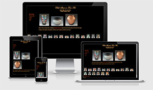
Beth Shearon Fine Art: Custom Commercial Fine Art Website created with PHP
This site loads art images and informational content from its database using SQL and PHP, and uses JavaScript for image interactivity.
This site is live: bethshearonfineart.com
Fine Art Photography by Beth Shearon.
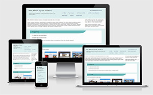
Portfolio site created with PHP, CSS3, and responsive design which fits both wide screen and mobile devices
Photo Edit section features CSS3 mouseover before and after transitions for both the thumbnails and the regularly sized photographs, and also includes an alternative page for older browsers which shows side-by-side before and after images.
This site is live: Digital Portfolio
“I've already sent it around on Facebook.
What a great site Beth!
I can't say it enough! You are the best!!!!!!!”
E.J.,
Enid, Oklahoma
Are customers seeing you?