Display width is an important aspect to good digital design, and we have two different directions going here:
Modern computer screens have a higher display resolution and more screen real estate than they used to — a screen display width of 1024 pixels was common in 2002 yet many dev companies are still rolling with a 960px grid. Ouch.
Mobile users are becoming more and more common. These screens are smaller and include special concerns for ease of mobile access, like not making the user have to zoom in and out constantly, or scroll back and forth just to read lines of text.
What these considerations mean is responsive design and development from the beginning, plus a great deal more attention paid to these smaller and larger screens in order to get them looking just right.
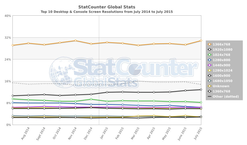
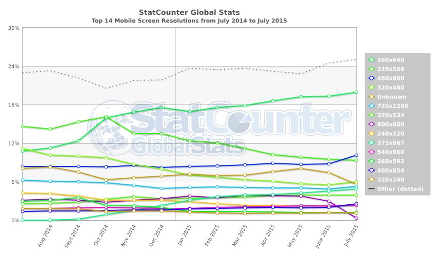
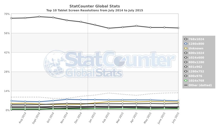
In the Stats section below there are three graphs which show the top desktop, mobile, and tablet resolutions globally according to Global Stats. By following the link for each, one can see the actual interactive graph on their site which will show individual monthly numbers on hover. The graph parameters can also be adjusted.
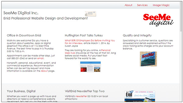
SeeMe Digital custom responsive website

Woblets template software website
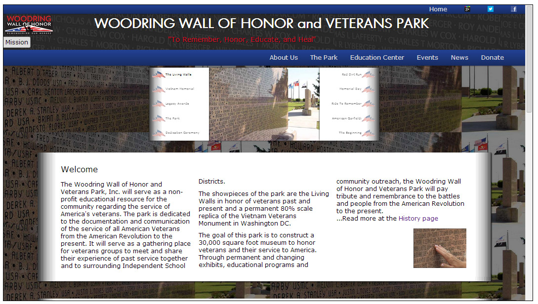
Woodring Wall of Honor and Veterans Park custom responsive website
Sites developed for 960, 977, or 1024 pixels like that Woblets template are only using one sixth of the real estate, as you can see, and are impossible to read.
If people don't know how to zoom, you've lost them completely. If they know how to zoom in and they are interested enough to actually do it, they have to zoom in several or many times just to be able to read your content.
Template software sites like Weebly and others are showing up like that for people. Sure, they're cheap, but they look like it.
Lots of expensive firms are using these ancient grids also, even some saying they are responsive. Check your own site here.
Many people don't know their site shows up like this until someone shows them a screen shot.
I wish I could publish all of the screen shots I would like to take of high-dollar "professional" sites which show up looking like that tiny template site with all the blank screen real estate.
Call me at 580-231-2342 or email beth at seemedigital dot com
... or pop into the office and I'll show you right there on my desk.
Computer Screen Displays: Screen shots are shown from 975 pixels wide to 1920 pixels wide
Mobile Screen Display Width Examples
These screen shots are from sites which have been responsively designed and developed. Instead of being too small or too big, they look like they fit on the smaller and bigger screen sizes.
The images are links if they are larger than 600 pixels wide, which will show the full size of the screen shot when clicked.
Once the screen shot loads remember to click the magnifying glass cursor if the image is larger than your browser to see the true size.
Want to get an idea of what your site looks like on different screens and devices? Here is a cool tool by Matt Kersley to get an idea of responsive design.
Do you want your business or organization to appear current, relevant, to look like it's still in business?
If you are one of the many whose website has been created at a static 960 pixels wide or even 1024 pixels wide, you are targeting (an ancient) less than ten percent of the population.
Are these people your only target market? If yes, great.
Many other people see a bunch of blank space around those little sites on a computer, and have to pinch and push, zoom and scroll, to be able to see those sites on mobile devices.
It makes the site look like it hasn't been updated since 2000.
Many of these screenshots were taken in the Chrome browser. Other browsers may look a bit different, especially on mobile devices.
These images have been reduced to really low quality jpg files to make them easier to download. Sorry for the blurriness, but this is a lot of graphic data and you know how I get about pages loading quickly.
The sites developed by SeeMe Digital for dynamic widths aren't just changing for monitor size, but for the actual browser size. If you are using a modern browser you can go to the live responsive sites (like this one) and slide your browser's width back and forth to see how the dynamic widths adjust as the browser changes.
If you're curious, the SeeMe Digital site is primarily designed for a 1920 by 1080 desktop or laptop screen, with three columns. The number of columns is reduced as the screens grow narrower. The development of the site focused on many mobile-first aspects, however, working for ease in mobile reading and also to keep the data and download speed low.
Are customers seeing you?

© 2012 – 2017 SeeMe Digital Inc.