
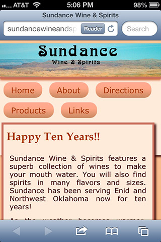
These screen shots are from sites which have been responsively designed and developed. Instead of being too small or too big, they look like they fit on the smaller and bigger screen sizes.
The site you are looking at right now is a good example, showing single column for narrow screens and expanding into two and then three column layouts as the screens become wider.
Also note the menu has been made very simple and touch-friendly.
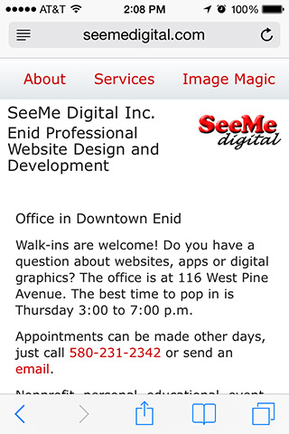
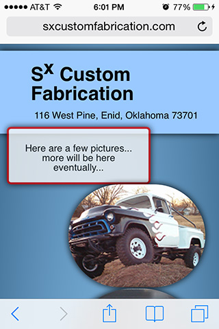
320 or 640 retina and HD example, iPhone 4S:
1080 by 1920 Samsung Galaxy S5:

Apologies for the poor image quality, trying to keep download speed reasonable
320 or 640 retina and HD:

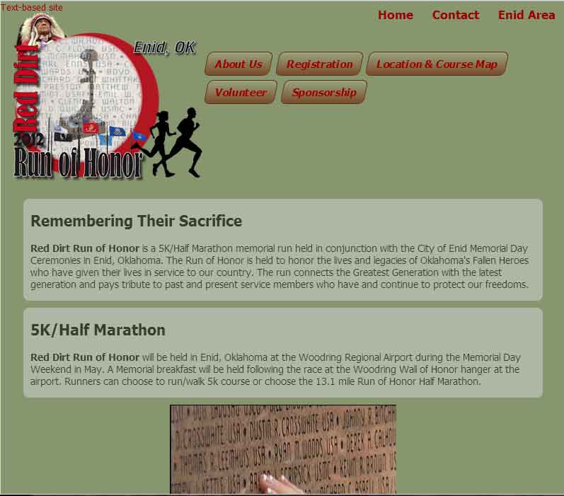
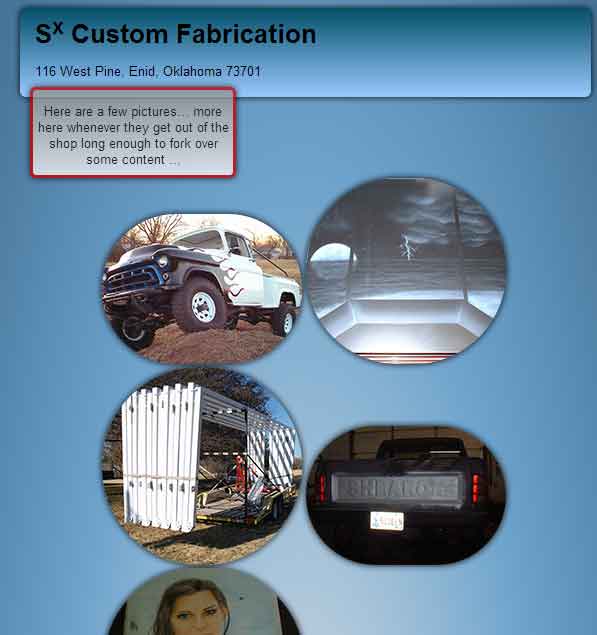
600:

800:
320 or 640 retina and HD:
600:
800:

320 or 640 retina and HD:
800:

There is not a full page desktop layout squeezed into tiny unreadable miniature on a phone.
The content does not go running off the sides of the screen.
The text size is easy to read when the device is held in the hand or sits close by.
The menu items are large enough to touch with fingers, without hitting two or three at once.
The pictures fit within the screen size.
Back to Display Width Overview page
Are customers seeing you?

© 2012 – 2017 SeeMe Digital Inc.