
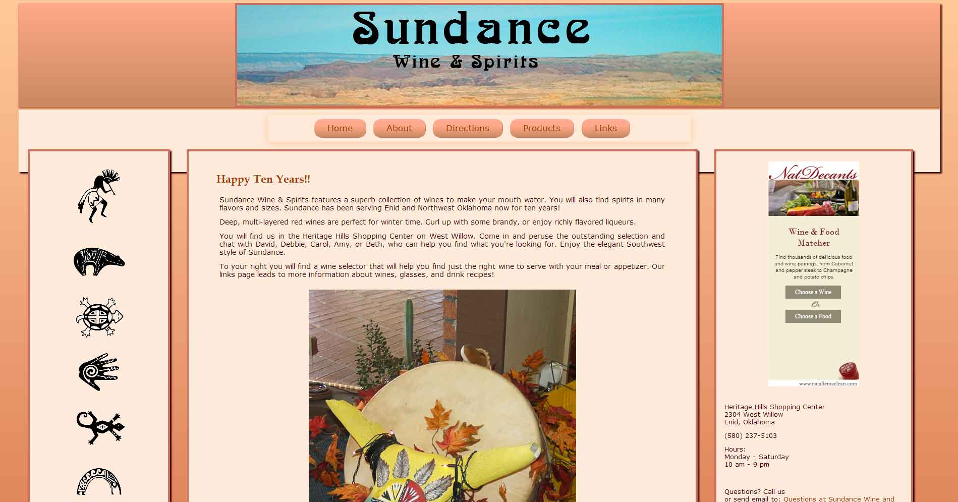
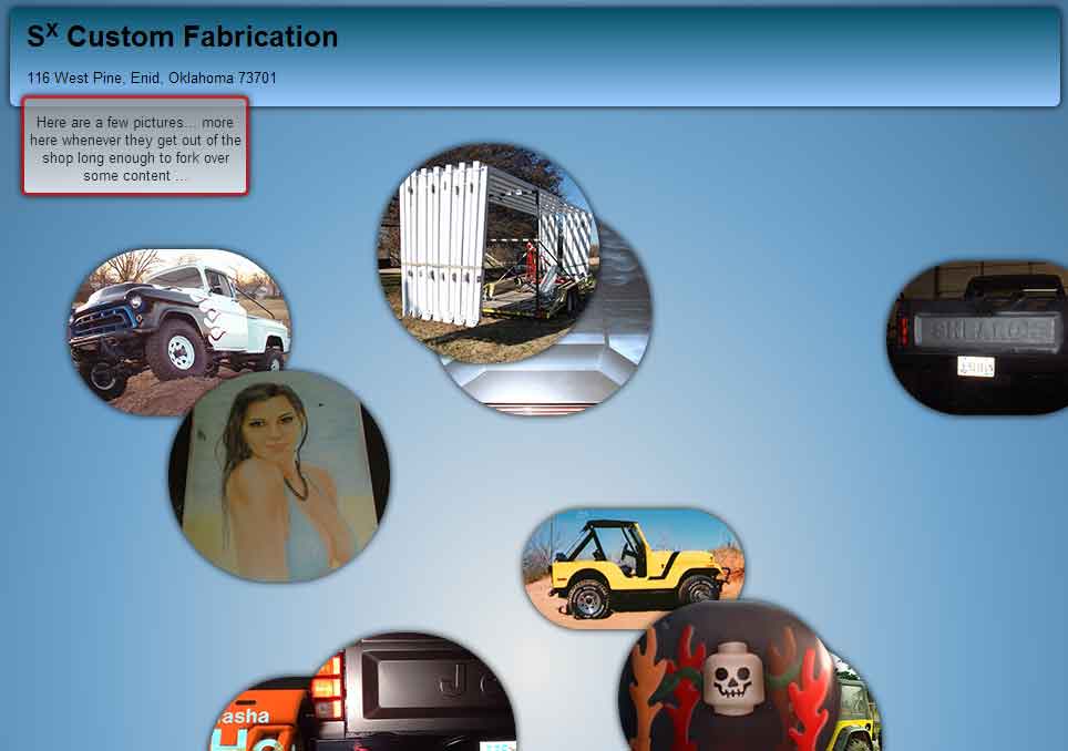
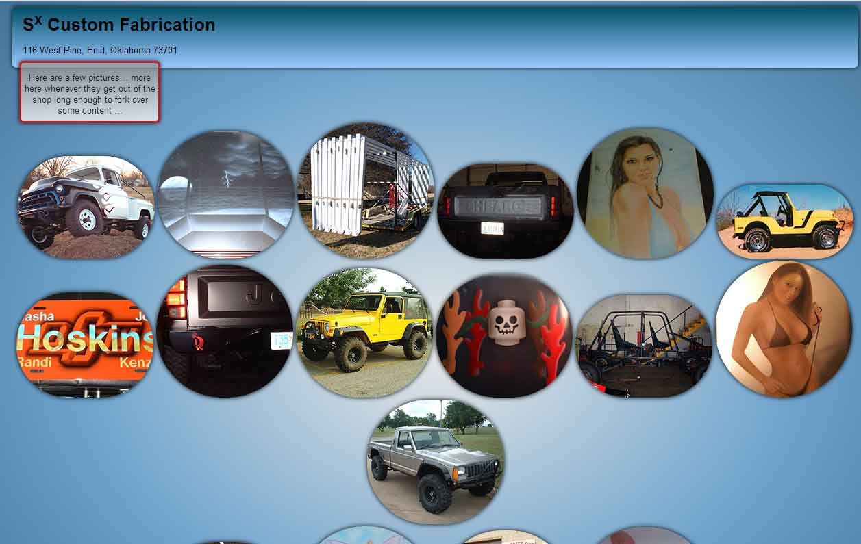
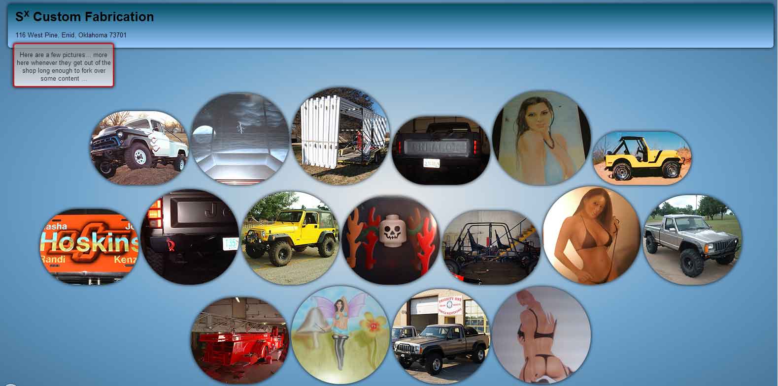
These screen shots are from sites which have been responsively designed and developed. Instead of being too small or too big, they look like they fit on the smaller and bigger screen sizes.
These images are links if they are larger than 600 pixels wide, which will show the full size of the screen shot when clicked.
Once the screen shot loads remember to click the magnifying glass cursor if the image is larger than your browser to see the true size.
Screen shots are shown from 975 pixels wide to 1920 pixels wide to show how a site can adjust accordingly to various monitor sizes and display resolutions.
975:

1280:

1600:

1920:

975:

1280:

1600:

1920:
975:
1280:
1600:
1920:
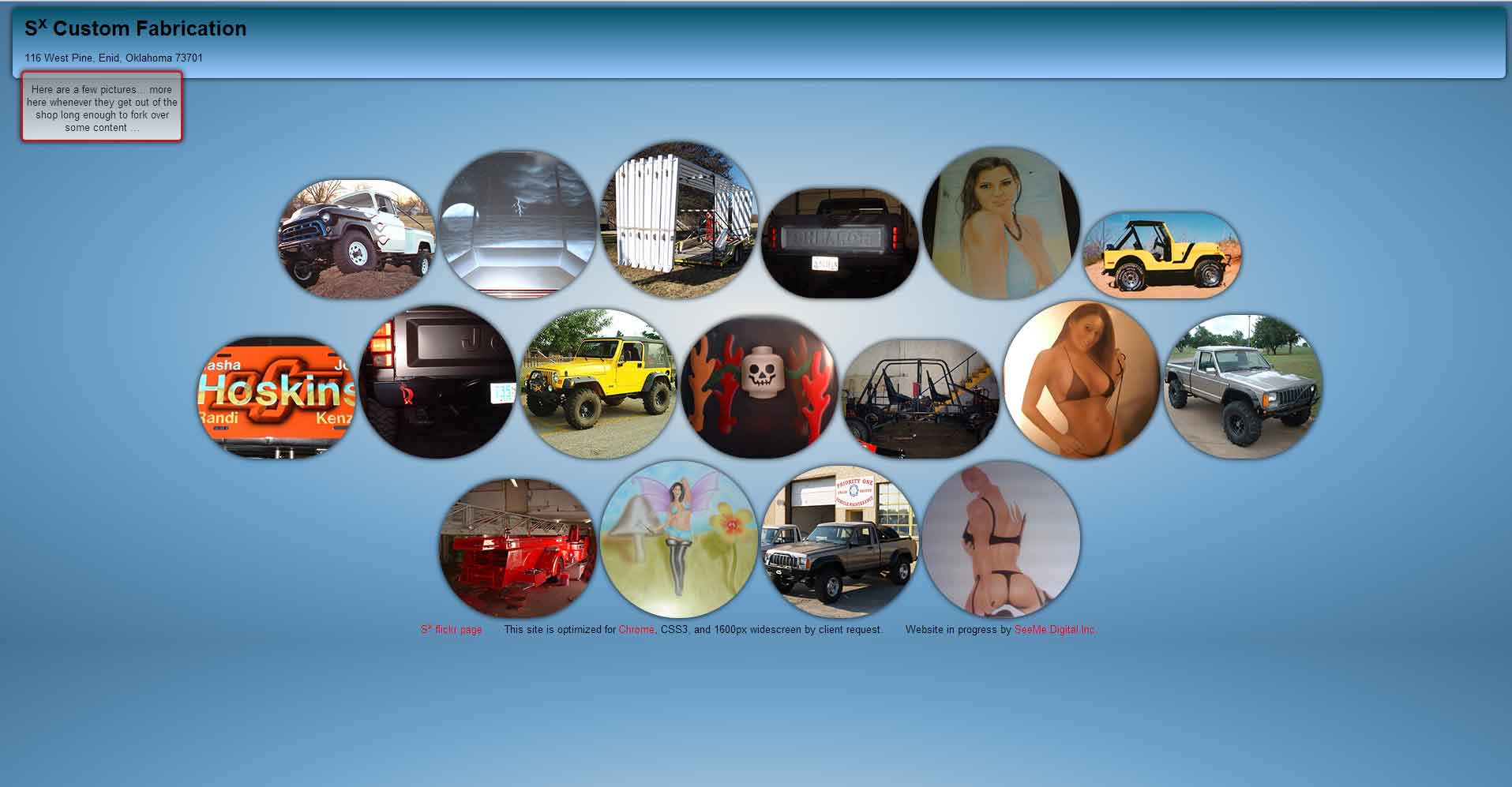
The content does not go running off the sides of the screen. The Sx site shot shows a bubble going off the side but those bubbles dance around for a little while and then settle down into their proper places, which are then fully on the screen.
The text size is easy to read when the device is at a proper distance.
The pictures fit within the screen size, expand larger where appropriate, and can also be made into a set of options for retina, HD, and higher pixel densities.
Do you want your business or organization to appear current, relevant, to look like it's still in business?
If you are one of the many whose website has been created at a static 960 pixels wide or even 1024 pixels wide, you are targeting (an ancient) less than ten percent of the population.
Are these people your only target market? If yes, great.
Many other people see a bunch of blank space around those little sites on a computer, and have to pinch and push, zoom and scroll, to be able to see those sites on mobile devices.
It makes the site look like it hasn't been updated since 2000.
Many of these screenshots were taken in the Chrome browser. Other browsers may look a bit different, especially on mobile devices.
These images have been reduced to really low quality jpg files to make them easier to download. Sorry for the blurriness, but this is a lot of graphic data and you know how I get about pages loading quickly.
The sites developed by SeeMe Digital for dynamic widths aren't just changing for monitor size, but for the actual browser size. If you are using a modern browser you can go to the live responsive sites (like this one) and slide your browser's width back and forth to see how the dynamic widths adjust as the browser changes.
If you're curious, the SeeMe Digital site is primarily designed for a 1920 by 1080 desktop or laptop screen, with three columns. The number of columns is reduced as the screens grow narrower. The development of the site focused on many mobile-first aspects, however, working for ease in mobile reading and also to keep the data and download speed low.
Back to Display Width Overview page
Are customers seeing you?

© 2012 – 2017 SeeMe Digital Inc.